
News
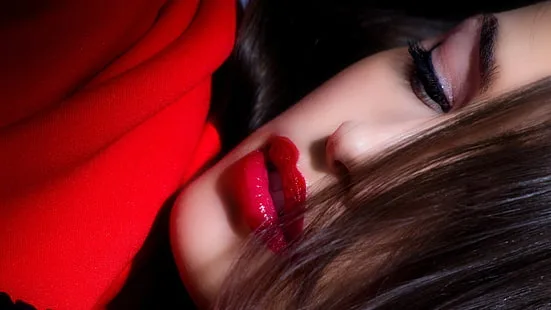
The Lip Liner Playbook: Sculpt, Balance, and Make Color Last
Sep
Part I — Foundations that Never Fail
Lip liner isn’t a border; it’s architecture. It decides where color lives, how edges read in different lights, how long your shade stays centered, and—quietly—how believable your lip looks from a handshake distance and on camera. A good liner can rescue a too-light nude, soften a loud coral, anchor a gloss, and keep a satin civilized through coffee. A great liner disappears into the look while doing all that work. This chapter builds your base literacy: what a liner truly does, how your mouth’s anatomy and coloring change the rules, which formats to pick and when, and how to find the single “invisible” shade that suits you every day—with two strategic specialists that give you pro-level range without a drawer full of duplicates.
1) What a liner actually does (beyond drawing a line)
Architecture (shape & symmetry). Liner is the scaffold your lipstick clings to. It sets the perimeter, firms the corners (the first place color disappears), and lets you micro-correct asymmetries so the mouth feels centered beneath your eyes and brows. Architecture is less about overlining and more about anchoring: a tiny triangle filled at each corner, a whisper along the bow, a faint feather inward so the bullet can snap to clarity.
Temperature control (undertone editing). Your natural lip color filters everything on top. A peach-nude can go gray on cool lips; a rose can turn fuchsia on warm lips. Liner lets you pre-tint the canvas: a mauve veil cools a too-warm shade; a peach veil warms a too-cool berry. Two thin strokes can save you the cost of a new tube.
Longevity (grip & gradient). Wax content and pigment density give liners unusual staying power. When you lay a soft stain of liner over the whole lip (or just the center), you create a color “underpainting” that stays when cream or gloss wears away. Edges remain defined; centers don’t hollow into the dreaded donut fade.
Edge behavior (feathering prevention). A clear, waxy barrier pencil drawn just outside the lip line is a speed bump for migrating oils. Pair it with a tinted liner at the edge and your gloss suddenly behaves like a diplomat.
Finish translation (matte ↔ satin ↔ gloss). The same bullet reads different over different bases. Liner deepens value, increases structure, and—if you feather inward—creates a built-in gradient that makes mattes look plush instead of flat, satins look refined instead of slippery, and gloss look intentional instead of sticky.
![]()
2) Your anatomy is your instruction manual
Vermilion border & white roll. The natural “ridge” around the lip (the white roll) catches light. Some mouths have a strong ridge, others barely any. If your white roll is pronounced, crisp edges can look severe in cool LED light; clouding the perimeter by a millimeter keeps things elegant. If your white roll is faint, a precise liner brings back shape and prevents lipstick from reading “melted” into the face.
Cupid’s bow architecture. Deep V, soft arc, or flat bow—each needs different pressure. Deep Vs look refined with a micro-point; soft arcs benefit from drawing a gentle chevron (two tiny strokes that meet, then softened). Flat bows can gain lift from extending the peaks slightly upward before rounding—think “polite parentheses,” not triangles.
Corner hinges (commissures). Corners are humid, mobile, and where lipstick fails first. Train yourself to address them before anything else: fill a tiny triangular patch with liner up to 2–3 mm inside the lip. This structural patch alone can add hours of neatness.
Surface texture. Mature or textured lips love liner not for the outline but for the fill: sketch a thin veil across the body, then apply bullet. The veil smooths micro-ridges and keeps color from pooling into vertical lines.
Asymmetry & visual balance. Most mouths are asymmetric by a millimeter or two. Instead of chasing perfect symmetry (which can look uncanny), use liner to balance the read: lift the lower edge slightly on the visually lower side, or give one peak of the bow a 1–2 mm boost. Step back at arm’s length or check on your phone camera—if the mouth feels centered with the eyes and brows, you’re done.
3) Undertone, value, and natural lip depth: the color math
Undertone (warm–cool–neutral).
Warm lips (peach, brick, brown-rose) push bullets warmer. Mauve liners counter this when you want a cooler red or berry to stay true.
Cool lips (mauve, bluish-rose) make peaches turn gray and corals scream. A peach or caramel liner underlay warms and calms.
Neutral lips can swing either way; keep both a mauve and a peach liner to steer on demand.
Value (light↔deep). A nude that matches your skin may be too light for your lips, causing chalkiness. One step deeper than your natural lip is usually the sweet spot. Liner is the fast fix: add depth around the perimeter and blend inward to bring the nude back to believable.
Chroma (muted↔bright). Bright bullets sometimes feel loud in daylight. Dusting the lip with a muted liner (mauve under coral, cocoa under cherry) lowers the chroma without changing the hue.
Opacity needs. Deeply pigmented lips may need a liner fill to neutralize before light shades; fair lips can use liner strategically at corners to avoid a “floating” pale center.
4) Formats, textures, and when to use which
Traditional wooden pencils.
Pros: precision, adjustable sharpness, firmer wax for edge control, long wear.
Best for: crisp edges, feathering-prone finishes, structural work at corners and bow.
Notes: keep sharp but not needle-point; draw with the side of the tip to avoid harsh tracks.
Mechanical twist-ups.
Pros: convenience, consistent point, usually creamier glide.
Best for: diffused outlines, full-lip veils under satin/cream, on-the-go touch-ups.
Notes: if too creamy, set the edge with a whisper of translucent powder.
Gel liners.
Pros: glide of cream with cling of wax; great for comfortable full fills.
Best for: stain-underlays, blurred looks, plumping illusions (soft overline + feather).
Notes: cap tightly; they can dry out faster than pencils.
Hybrid stain liners.
Pros: sheer dye effect; ideal for longevity without weight.
Best for: humid climates, mask days, color that must survive lunch.
Notes: work fast; blend immediately before the dye sets.
Clear barrier pencils.
Pros: invisible fence for glosses/creams; corrects feathering without color.
Best for: mature lips, hot rooms, cocktail hours, any day gloss fights the perimeter.
Notes: draw outside the lip line; think “speed bump,” not outline.
Pot/cream liner with brush.
Pros: ultimate control; painterly edges; mixable.
Best for: editorial sharpness, ombré, custom shades.
Notes: higher maintenance; more sanitary prep.
5) Finding your “invisible” everyday liner (the one that disappears)
Your everyday liner should be one tone deeper than your natural lip, neutral-to-slightly-warm if your lips skew cool, and neutral-to-slightly-cool if your lips skew warm. Test it in three lights—window daylight, office LED, and a warm lamp. Apply just at the corners and feather 1–2 mm inward. If the mouth looks fuller but no one could point to a line, you’ve found it. This shade should make any everyday bullet look better—MLBBs become astounding, reds stop bleeding, nudes stop chalking.
How to swatch right:
Apply to the lip, not the hand.
Blur the inside edge with fingertip—judge the blend line, not the stripe.
Smile slightly to flatten micro-folds and check for catchiness; if the tip skips, the formula is too dry for you.
6) Two specialists that multiply your options
The temperature editor (mauve or peach).
A mauve liner under warm shades cools the base—perfect for keeping corals civilized or keeping a true red from turning orange under LEDs.
A peach/caramel liner under cool berries or plums warms them just enough to flatter olive or warm skin.
One pass changes how a whole drawer behaves.
The depth anchor (cocoa/rosewood).
A deeper neutral (cocoa for warm/neutral; rosewood for cool/neutral) adds contour at the outer third of the lip. Tap inward to create a gradient. This anchors glosses and pale nudes, makes lips read fuller without a heavy overline, and photographs beautifully.
7) The universal map: corner-first, feather-inward, then bow
Order matters because of migration and movement. Start where breakdown starts.
Corners: fill the tiny triangles; this prevents hollowing and keeps edges clean through speech.
Lower lip outer thirds: lightly sketch, then feather inward 1–2 mm; leave the very center lighter for volume.
Cupid’s bow: sketch the peaks with two soft strokes that meet; if you like a defined bow, connect with the lightest pressure across the dip.
Check symmetry at phone distance: your eyes self-correct in mirrors; cameras reveal balance.
This method gives structure without a hard outline—and makes reapplication faster because the architecture is already there.
8) Overlining that reads like volume (not a sticker)
The trick is to overline on structure, not skin. Feel for the place just beyond the vermilion where the skin rises (the white roll). Place your line on top of that ridge, not below it on flat skin. Overline only where you need fullness—often the top peaks and the lower lip’s outer thirds—never the entire lower center, which can look puppet-like. Blend the inside edge of the line toward the lip; the outside edge remains nearly invisible thanks to the halo or barrier pencil. Finish with a center highlight (sheen or a lighter dab of bullet) so light, not ink, is doing the plumping.
9) Liner by finish: tailoring to your lipstick texture
Matte. Use liner as scaffolding and stain. Two passes: first to map and fill corners, second as a light veil over the whole lip. Apply matte thinly over top, blot once. Result: crisp edges, no dryness look, even fade.
Satin. Liner defines without hardening. Map corners and bow, feather 1–2 mm inward, apply satin, then press lips to blend. If you want longer wear, set through a single-ply tissue; keep gloss off the perimeter.
Cream. Because creams move, the liner base should be firmer. Choose a wooden or long-wear pencil; fill corners and the outer third, then apply cream sparingly, staying shy of the inner rim.
Gloss. Start with a clear barrier outside the line, then a neutral liner to define the edge and add depth at the outer thirds. Place gloss only at the bow and center; press lips together; do not sweep edge-to-edge.
Lacquer-stain. Build your liner stain first; keep edges clean; apply the lacquer thinly. Reapply lacquer to the center only as shine fades—the stain carries the color.
10) Lighting literacy: edge choices by room
LED office lighting. Cool, flattening, unforgiving of glare. Choose precise edges and soft-matte or satin finishes. Your liner should crisp the bow and corners; avoid heavy gloss at the border.
Indirect daylight. Honest but kind. Blurred edges look modern; a soft veil of liner across the lip with clouded perimeter reads plush and effortless.
Warm tungsten/candlelight. Everything warms and softens. A little more definition at the bow keeps lips from disappearing in the glow; liner deepens the outer thirds so satin sings.
Flash photography. Ultra-deep shades can “black out,” and pale nudes can vanish. Use liner to hold a mid-value contour; edges clean, center slightly lighter for dimension that survives flash.
11) Building the capsule: three liners, endless looks
1) Invisible Neutral (your lip but clearer). One tone deeper than your lip; neutral temperature. Daily structure, pairs with everything, rescues nudes, tames reds.
2) Temperature Editor (mauve or peach/caramel). For undertone control across seasons and wardrobes. Mauve for cooling warm shades; peach/caramel for warming cool ones.
3) Depth Anchor (cocoa/rosewood). For contour, evening depth, and ombré gradation that flatters gloss and pale bullets.
With those three, you can follow any of the techniques in later sections—blurred matte, plush satin, lacquered center, day-to-night conversions—without hunting for brand-specific matches. They also keep you from buying duplicates of lipsticks you already own: instead of chasing the “almost right” shade, you steer the one you have.
12) Hygiene, sharpening, and glide (so your tools behave)
Sharpening. Keep wooden pencils just sharp enough to draw with the side of the tip. Over-sharpened points scratch and skip; under-sharpened smudge. A few quick turns, then test on the back of your hand.
Sanitation. Wipe the tip with a little micellar or alcohol on a cotton pad if you’ve had a cold sore or shared your pencil; let dry fully before capping.
Glide control. If a pencil tugs, warm the tip on the back of your hand with a few quick circles. If it’s too soft, pop it in the fridge for five minutes. For long sessions or heat, blot the edges of the lip with tissue before lining—makeup-dry edges = cleaner lines.
13) Common myths to retire
“Liner makes lips look smaller.” Only if you draw a thin, dark ring and leave it. Feathered inward and paired with strategic center light, liner actually enlarges the mouth—optically and believably.
“You must match liner to lipstick exactly.” Close families work; exact matches are optional. Temperature and depth harmony matter more than perfect duplication.
“Clear liner is enough.” It’s great for feathering control, not for architecture or temperature edits. Keep one clear for gloss days, but don’t expect it to do all jobs.
“Overlining equals fake.” Heavy-handed overlines read staged. Subtle structure—1–2 mm on the peaks and outer thirds—reads like anatomy, not ink.
14) Fast tests to find your defaults
Split-lip test. Line and blur one half with Mauve Editor under a warm lipstick; line and blur the other half with Peach Editor. Step into daylight and LEDs. Which half looks truer to your intention? That’s your go-to editor.
Three-lights bow check. Draw your usual bow; photograph in window light, overhead LED, and a lamp. If one photo shows a collapsed bow, increase liner definition there for that room type.
Corner endurance. Wear your favorite satin with and without the corner triangles filled. The version with corner fill will still look neat after lunch. Make the feeling of that neatness your new baseline.
15) Bringing it together: liner as quiet power
The best lip days don’t announce their technique. They read as you—clearer. With an invisible neutral, a temperature editor, and a depth anchor, you can make any bullet behave: a pale nude becomes polished, a bright coral calms into joy instead of noise, a red becomes architecture not audition. Your edges can be sharp without meanness, blurred without laziness, plush without mess. And because liner is thin, precise, and strategic, it saves you time and money: fewer emergency reapplications, fewer “almost right” lipsticks, more finished tubes.
Treat liner not as a requirement but as a lever—a small move that changes everything. Once you learn your map (corners first, feather inward, decide the bow), understand your color math (undertone, value, chroma), and carry the right three pencils, you’ll find your lip routine gets faster, your looks get calmer, and your confidence gets louder without you raising your voice.
Part II — Techniques for Real Faces & Real Days
Liner is small, but its leverage is huge. A few millimeters of pigment decide whether your nude looks expensive or absent, whether your red feels architectural or anxious, and whether gloss behaves like a glow or a spill. These are the field-tested techniques that translate to busy mornings, mixed lighting, and real mouths—not studio-perfect lips. Keep your three-liner capsule nearby (Invisible Neutral, Temperature Editor, Depth Anchor), and watch how far you can push every bullet you already own.
1) Corner-first mapping: fix the failure point before it fails
Most breakdown starts at the corners (commissures). Start every application there.
Smile gently to flatten the area.
With your Invisible Neutral, fill a tiny triangle at each corner—about 2–3 mm inside the border.
Feather that pigment inward a hair so there’s no hard seam.
Result: lipstick won’t hollow at noon, and the edge stays tidy through coffee and calls.
2) Cupid’s-bow precision—crisp without stiffness
A crisp bow can look severe if it’s built like a stencil. Try the “chevron-soften”:
Draw two light strokes that meet at the bow peaks (a soft chevron).
Connect across the dip with a whisper, not a trench.
Tap once with fingertip to melt the join but leave the peaks intact.
This holds shape on camera without reading sharp in person.
3) Soft overline that reads like volume (not a border)
Overline only where anatomy supports it: the white roll (the little crest right at the border).
Place Depth Anchor on the top peaks and the outer thirds of the lower lip, sitting on the crest—not on flat skin.
Blend the inner edge toward the lip; leave the outer edge nearly invisible.
Add a dot of sheen at the center after lipstick.
Light does the plumping; the pencil just sets the stage.
4) Gradient and ombré: modern depth in 30 seconds
Ombré isn’t 2016 if you keep it subtle.
Trace edges and outer thirds with Depth Anchor.
Fill the center lightly with Invisible Neutral or nothing at all.
Apply lipstick; press lips together; add one more touch of Depth Anchor only at the very corners if needed.
You’ll get plush dimension that makes creams and satins look editorial, not heavy.
5) Stain-underlay: the all-day backbone
When you need longevity without bulk, lay a liner stain:
Sweep Invisible Neutral (or your Temperature Editor if you’re correcting undertone) over the whole lip in swift, sketchy strokes.
Press with fingertip to push pigment in.
Apply your bullet in thin layers.
As shine fades, color remains; edges don’t collapse.
6) Finish-specific strategies (matte, satin, cream, gloss, lacquer)
Matte: Use liner as cushion. Veil the lip with Invisible Neutral, then matte in two whisper coats with a blot between. If matte looks stern, cloud the perimeter with a clean fingertip.
Satin: Line corners and bow; feather inward 1–2 mm. Apply satin, press lips, and—if needed—set through a single-ply tissue to land in a satin-stain sweet spot.
Cream: Pick a slightly firmer pencil (wooden). Fill corners and outer third so the cream has something to cling to. Apply color shy of the inner rim to dodge donut fade.
Gloss: Draw a clear barrier just outside the border; define edges with Invisible Neutral; add depth on outer thirds with Depth Anchor. Place gloss on the bow and center only, then press. Never sweep edge-to-edge.
Lacquer: Build a tidy liner stain first. Keep lacquer thin. Reapply shine to the center only; the stain carries the color story.
7) Temperature editing: steer undertone without buying new bullets
Two pencils turn “almost right” into “exactly right.”
Coral too loud or pulling orange under LEDs? Veil the lip with Mauve Temperature Editor, then apply coral thinly. It becomes sunlit, not neon.
Berry skewing fuchsia or making teeth look cool? Use Peach/Caramel Editor first, then berry. The warmth grounds it; smiles stay bright.
Red inconsistent between rooms? Try a quick half-and-half test at home (mauve base on one side, peach on the other). Choose the side that stays truest in LED and daylight; make that your default.
8) Blur for plush looks that still read finished
The “cloud lip” is adulting now: soft, purposeful, camera-safe.
Sketch Invisible Neutral on the perimeter only.
Tap inward with fingertip until the edge looks like breath on glass.
Add a satin or balm-tint and repeat the tap.
You get softness that doesn’t slump into mess because the edge still has pigment control.
9) Day-to-night conversions with one pencil and one topper
You don’t need a whole makeup bag for the evening pivot. Bring Depth Anchor and a clear topper.
Office → Dinner (Satin): reinforce corners with Depth Anchor, add a micro-glaze on the bow and center.
Matte → Velvet Night: smudge Depth Anchor on outer thirds, press to blend; add a dot of topper only at center—dimension without losing structure.
Nude → Polished: deepen perimeter with Depth Anchor; keep center lighter; instant “expensive” nude under warm light.
![Review] Top 6+ Hãng Son Môi Nào Tốt Và Đẹp Nhất Hiện Nay](https://cdn.prod.website-files.com/5eb51614ce7c0b6b10d42789/5f962ca420465e3d429012dc_son-moi-tot-nhat-6.jpg)
10) Lighting literacy in practice (LED, daylight, candlelight, camera)
LED office: edges collapse on camera if they’re fuzzy; crisp the bow and corners. Prefer soft-matte or blotted satin. If a shade dulls, add one notch of chroma or a cooler base (mauve editor).
Daylight: honest but kind—try blurred edges. If a color feels loud, reduce chroma with a light veil of Depth Anchor before lipstick.
Warm evening: candlelight loves sheen but blurs shape; give the bow a touch more definition with Invisible Neutral, then place sheen center-only.
Webcam/phone video: compression steals detail and amplifies glare. Keep gloss off the perimeter; use Depth Anchor on outer thirds for volume that survives pixels.
11) Fix a chalky nude—three moves, no product swap
Add Depth Anchor to outer thirds and corners; feather inward.
Switch edge to Invisible Neutral, not the lipstick shade itself.
Finish in satin, not strict matte; or blot matte once to a satin-stain.
Now the nude matches lip depth and looks intentional.
12) Keep reds civil and confident
Blue-red for LEDs: Invisible Neutral map + two thin matte coats; optional tissue set.
Garnet for evenings: Depth Anchor contour at outer thirds, satin red on top, center sheen pin-prick.
Cherry you can live in: Temperature-correct base (mauve under warm rooms; peach under cool lips), lacquer only at center, stain carries the edges.
13) The “donut fade” antidote
You’re loading the inner rim.
Apply short of the wet line by 1–2 mm.
Build a liner stain, then lipstick; blot between layers.
If you must refresh, micro-coat the center only—don’t sweep the whole mouth.
14) Correcting asymmetry without inviting the uncanny valley
Identify the visually lower peak or side by checking a quick phone photo.
Lift only that side with a 1–2 mm addition using Invisible Neutral; never “fix” both sides.
Recheck at arm’s length; stop when the mouth feels centered beneath the eyes, not when it measures perfectly.
15) Speed routines (because mornings are short)
Two-step polish: corners triangle + Cupid’s bow with Invisible Neutral → thin coat of lipstick, press.
Meeting upgrade: re-line corners with Depth Anchor → tap center sheen.
Outdoor brunch: stain-underlay with Invisible Neutral → balm-tint → blurred edge tap.
16) Clean reapplication protocol (no cake, no slide)
When color looks tired, resist the urge to swipe:
Blot once.
Re-trace corners (Invisible Neutral) and barrier line if you’re wearing gloss.
Micro-coat only where color is missing; press lips to blend.
Optional center sheen.
Ninety seconds, and you look newly done—not layered.
17) Common pitfalls, instant fixes
Sticker outline: you drew a complete dark ring. Feather inward 1–2 mm and add a lighter center.
Feathering despite barrier: you’re placing gloss edge-to-edge. Move shine to center only; reinforce the clear line outside the lip.
Tuggy pencil: warm the tip with a quick scribble on the back of your hand.
Too-soft pencil in heat: fridge for five minutes or set the perimeter with a breath of powder after the halo.
18) The three-move masterclass (learn once, reuse forever)
Corners first—tiny triangles, always.
Feather inward—never leave a hard inner seam.
Decide the bow—chevron-soften for everyday, crisp-connect for authority.
Layer finish to taste; the architecture remains constant.